
The colors of gemstones and their meaning are one of the most intuitive ways to choose jewelry with intention. Color speaks before words: it sparks memories, anchors emotions, and transforms a look. In this practical, in-depth guide —updated for 2025— you’ll find a complete roadmap to decide by color with confidence: messages linked to each hue, metal combinations, suggestions by personal style and occasion, personalization ideas, mistakes to avoid, and a final checklist. At the end, you’ll see links to related articles to go deeper.
Why choose jewelry by color
Choosing by color means choosing by message. Hues don’t just harmonize with skin and clothes — they tell a story. A blue center suggests calm confidence; green speaks of balance and new beginnings; red communicates resolve; white/clear, clarity. This reading is simple, memorable, and extremely useful when you want jewelry with meaning.
Color is also the perfect bridge between aesthetics and emotion: it lets you wear an idea (a “north star,” a wish, a memory) without saying it out loud. That’s why gemstone colors and their meaning are a favorite criterion for intentional gifts and everyday pieces.
How to use this guide to gemstone colors and their meaning
To get the most out of it, think through three decisions that feed into each other:
- Message: what do you want to highlight right now (confidence, new start, romance, strength)?
- Context: will you wear it daily, at work, on special occasions? Do you prefer discretion or presence?
- Aesthetics: choose a shape (round, oval, pear, princess, emerald, cushion, hexagon), a dominant metal, and a sparkle level (minimal or with a halo).
If you want a step-by-step tutorial to choose your stone by color, save this article and then visit how to choose a stone by color, where you’ll find more detailed decision maps.
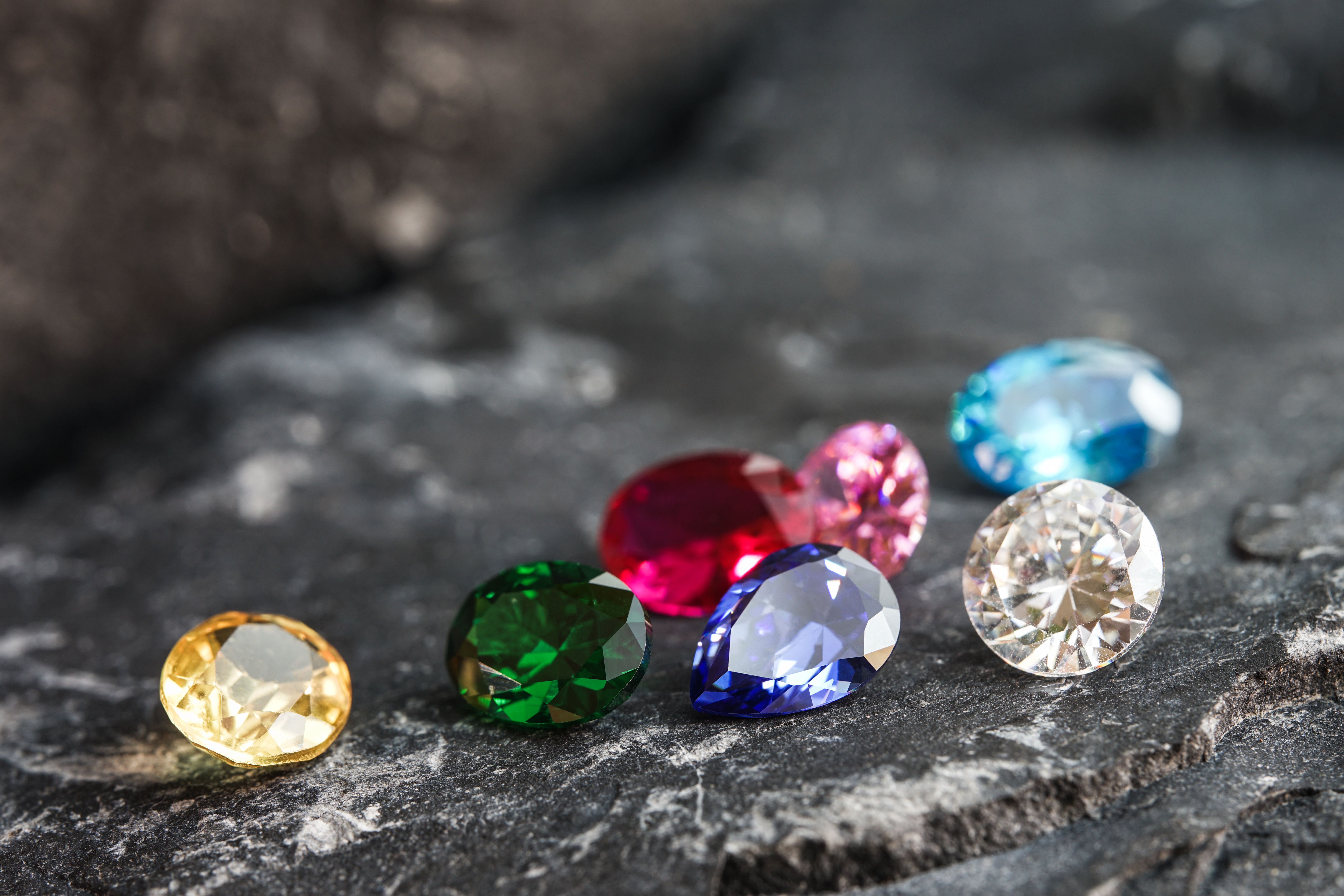
Quick summary of meanings (2025)
A quick glance before diving in. (If you like to go deep, below we unpack each color with real use ideas.)
| Color | Main message | Style idea | Best-matching metal |
|---|---|---|---|
| White / Clear | Clarity, versatility | Solitaire or fine halo | All (cool tones enhance purity) |
| Blue | Confidence, calm | Minimal + geometry | Rhodium-plated silver / cool two-tone |
| Green | Balance, new beginnings | Oval with subtle halo | Yellow gold |
| Red | Passion, resolve | Vintage / Art Deco | Yellow or rose gold |
| Pink | Modern romance | Soft solitaire | Rose gold |
| Yellow/Gold | Energy, celebration | Bold geometry | Yellow gold (monochrome) |
| Purple/Violet | Intuition, creativity | Ultra-fine halo | Rhodium/silver or rose gold |
| Black | Strength, avant-garde | Hexagon / princess | Mixed metals |
| Orange/Coral | Joy, drive | Comfortable low profile | Yellow gold |
| Iridescent/Multicolor | Play, change | Clean bezel | Depends on the dominant tone |
White/Clear: clarity and versatility
White/clear is the universal “wild card”: it conveys clarity, elegant simplicity and openness. Perfect as the first piece in a collection or whenever you want a jewel that goes with everything.
- When to wear: interviews, formal events, days when you want focus and lightness.
- Friendly shapes: round (maximum sparkle), oval (sleek elegance), princess (sparkle with edges).
- Metals: all. Rhodium-plated silver highlights purity; golds add warm contrast.
If the halo as a symbol of “light that accompanies” appeals to you, the ultra-fine version multiplies brilliance without overdoing it. Get inspired with combinations in rings with stones.
Blue: confidence and calm
Blue is calm that decides. Elegant in cool looks; a sophisticated accent on neutral palettes.
- When it shines: key meetings, interviews, trips you want to remember (coordinates engraved inside the band).
- Shapes: oval to elongate; princess for geometric character; round for classic presence.
- Metals: rhodium-plated silver or cool mixes. A subtle two-tone adds modernity without losing serenity.
Tip: think of blue as an “anchor.” If you’re starting your set, begin with blue + cool metal and add a clear pendant.
Green: balance and new beginnings
Green suggests balance, growth and the beautiful idea of a fresh start. It’s the color of people celebrating personal milestones.
- When it shines: life changes, new projects, anniversaries looking to the future.
- Shapes: oval with a subtle halo; emerald cut for a Deco read; cushion for soft romance.
- Metals: yellow gold for a warm dialogue; rhodium/silver if you prefer freshness.
If you want an occasion-based guide (work, ceremony, summer, night), save this article and read gem colors and occasion.
Red: passion and character
Red is resolve and energy. It has special magnetism for events with classic or vintage dress codes.
- When it shines: dinners and celebrations; gifts with a “passion, no detours” message.
- Shapes: pear to set direction; princess for elegant geometry; oval for balance.
- Metals: yellow or rose gold; with rhodium/silver it creates dramatic contrast.
In lower profiles it’s easier to wear daily. If you love storytelling, explore engagement ring stories and symbolism and adapt ideas.
Pink: modern romance
Pink is contemporary tenderness. It’s associated with care, affection and a soft touch that doesn’t give up elegance.
- When it shines: proposals with a twist, anniversary gifts, intimate celebrations.
- Shapes: cushion, oval or round as a clean solitaire; ultra-thin halo if you want extra sparkle.
- Metals: rose gold for monochrome harmony; rhodium/silver if you want a fresh contrast.
Yellow/Gold: energy and celebration
Yellow and gold communicate joy, energy and a festive spirit. An excellent accent for warm skin tones and luminous looks.
- When it shines: spring/summer, daytime events, special birthdays.
- Shapes: princess and hexagon (modern read), oval if you want softness.
- Metals: yellow gold for radiant monochrome; two-tone if you want controlled contrast.
Purple/Violet: intuition and creativity
Purple is the color of serene creativity: it mixes introspection with spark. It works wonderfully in minimalist looks with a hint of mystery.
- When it shines: presentations, openings, moments when you want to “think and shine.”
- Shapes: emerald cut for an intellectual read; round with a fine halo for a subtle aura.
- Metals: rhodium/silver or rose gold depending on the stone’s cool/warm undertone.
Black: strength and avant-garde
Black brings contrast and modernity. It “quiets” the rest of the look to center the gaze on the piece.
- When it shines: evening events, architectural outfits, monochrome sets.
- Shapes: hexagon, princess, emerald; clean lines and graphic presence.
- Metals: two-tone mixes and rhodium/silver; gold creates a theatrical contrast.
Orange/Coral: drive and joy
Orange and coral radiate enthusiasm. As an accent, they light up the skin and add a controlled playful touch.
- When it shines: summer, getaways, gifts celebrating personal milestones.
- Shapes: round for a cheerful sparkle; oval to elongate; bezel for a casual vibe.
- Metals: yellow gold or warm two-tone.
Iridescent & multicolor: play of light
Some stones change with light or show several colors at once. They’re the perfect metaphor for movement and transformation.
- When it shines: for detail lovers, looks that want an unexpected twist.
- Shapes: bezel or fine prongs to let in light; subtle halos if you want more brilliance.
- Metals: decide based on the dominant tone (cool or warm). Two-tone can tie it all together.
How to pair color and metal
Metal frames the color. A simple rule that works in most cases:
- Cool metals (rhodium-plated silver): boost blues, cool greens and whites. Clean, contemporary look.
- Warm metals (yellow/rose gold): enhance warm greens, reds, pinks and yellows. A celebratory feel.
- Mixed/two-tone: add modern contrast and make it easier to combine with other jewelry. Useful if your wardrobe blends cools and warms.
If you want to go deeper by occasion —office, ceremony, summer, evening— visit gem colors and occasion for concrete examples.
Choose color by your personal style
The same color can be “dressed” in a minimalist, romantic or geometric way. Quick ideas to hit your visual language:
- Minimalist: clean lines, bezel or fine prongs. White, blue and black work as elegant wild cards.
- Romantic: ultra-fine halos, oval and pear shapes, soft pinks and reds, rose gold.
- Geometric: princess, emerald or hexagon cuts; blues, blacks and golds; two-tone to underline contrasts.
- Vintage/Deco: deep reds, intense greens, contrasted whites. Milgrain and period details.
If you want a broader guide to ring types, see women’s rings 2025 and jewelry trends 2025.
Color by occasion: from everyday to ceremony
Context multiplies color’s effect. Quick summary (then the full guide in the dedicated article): gem colors and occasion.
- Everyday: whites/clear, mid blues, soft pinks. Low profiles and comfortable bands.
- Work: blues and whites for focus; moderate greens to convey balance.
- Evening & events: blacks, reds, intense greens, purples. Fine halos and marked geometries.
- Ceremonies: whites, pinks and soft blues; combinations that converse with the outfit without competing.
Color personalization: engravings, halos and two-tone
Color can be the protagonist of your story. Ideas to turn it into a narrative without overloading:
- Inner engraving with a word that condenses the message (e.g., “serenity,” “begin,” “courage”).
- Hidden detail on the shank with a tiny stone in the favorite color.
- Detachable halo that appears on anniversaries/events, leaving a minimal piece the rest of the time.
- Metal mix (two-tone) to underline chromatic contrasts.
If you want a step-by-step decision process, check how to choose a stone by color, with more detailed matrices and maps.
Care and maintenance: keeping color alive
Whatever tone you choose, a simple routine preserves brightness and color crispness:
- Store pieces separately to avoid micro-scratches.
- Clean with a soft cloth and lukewarm soapy water; avoid harsh chemicals.
- Check prongs and settings from time to time, especially with pavé or halos.
- Remove pieces at the gym, beach or during impact-heavy tasks.
Common mistakes when choosing by color
- Choosing only by trend without thinking about your story or real use. Start with message and context.
- Color overload: 1–2 tones per set are enough. Harmony communicates more than saturation.
- Forcing the metal: if your wardrobe is cool, very warm metals may feel off (and vice versa).
- Forgetting ergonomics: high profiles can snag; if you use your hands a lot, choose low profiles or bezel.
Checklist: choose your piece by color in 7 steps
- Write the message (confidence, beginning, romance, strength…).
- Select the color that best translates it.
- Choose the shape (round, oval, pear, princess, emerald, cushion, hexagon).
- Define the metal (cool, warm or two-tone) based on your wardrobe.
- Decide the sparkle level (minimal, fine halo, pavé).
- Plan a secret detail (engraving, coordinates, micro-stone).
- Plan the main occasion and how you’ll pair it with earrings and pendant.
Keep reading: related articles
Frequently asked questions
What’s the most versatile color to start a collection?
White/clear is the wild card. Mid blue also works brilliantly in cool wardrobes.
How do I know if a color “suits me”?
Think about your clothing palette: if you lean cool, choose cool metals and blues/whites; if you prefer warm, choose warm greens/reds/yellows with gold.
Can I mix several colors at once?
Yes, but limit to 1–2 tones per set. Coherence reads as elegance.
Which shape highlights color best?
Round and oval usually maximize sparkle; emerald and princess add a geometric read. Choose based on message and style.
Ready to choose by message? Explore designs inspired by the colors of gemstones and their meaning and create a piece with purpose at DICAROLO.